Analysis of Vogue Magazine - Lupita Nyong'o
Vogue - Lupita Nyong'o
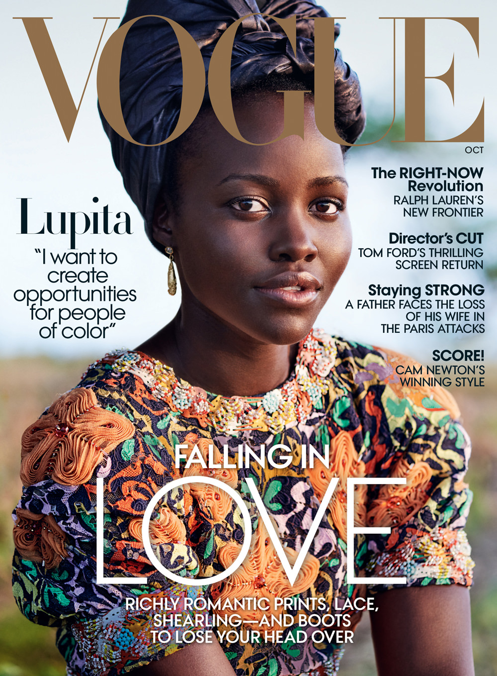
The masthead of the popular brand, Vogue is also written in bold gold serif font to emphasis the signification and sophistication of the brand. It draws the reader's attention and it is easily recognisable. There is no slogan or skyline because Vogue has confidence in their brand.
Cover Line
There is quite a lot of cover line around the magazine written thin sans serif font. It presents a sense of simplicity on the other hand elegance. The cover line also informs the audience of what the magazine is going to about.
Anchorage
Lupita Nyong'o is written in black and bold and is also one of the biggest headings. It draws the attention of the audience and makes them feel as if they know her personally. Vogue has only written her first name suggesting people already by her first name. it makes the magazine more personal and intimate. It includes a short quote of what she wants to do, which helps the readers know more about.
Main Image
Vogue' star image, Lupita, is presented in very approachable and welcoming manner. The mid shot shows more of her gentle body language and her friendly facial expression. She is showed to look more warm due to the light shinning on her.


Comments
Post a Comment